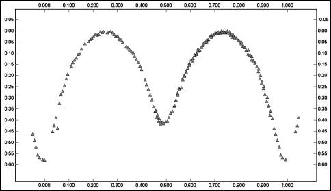
Figure 1. A phased plot of an eclipsing binary. Only the data from the first session is used here.
An alias for a period is another period where the data seemingly fits as well, or nearly so, as the original period. The most common encounter with aliasing is when you observe a target at regular intervals and the period has an even or half multiple that is almost exactly the interval between observing sessions. For example, if you work a target that has a period of 8 hours and you start observing at almost exactly the same time each night, you’re observing the same part of the curve each night. That’s because you are observing the target at the start of its fourth cycle from the original point in the curve. The same general idea holds true if the period is 4 or 6 hours. There’s an example of this below.
Another time you’ll run into aliasing is when you’re working a target with a symmetrical curve, i.e., one where it is very hard to tell one maximum/minimum pair from the other, and the interval between observations is a half multiple of the period. For example, say you are working a target with a period of 5.33333 hours. If the observing interval is 24 hours, then the target has gone through 4.5 cycles. If the curve is symmetrical, you don’t know – unless you get enough data on a single night – which part of the curve you’re working. Since 5.3333 hours is probably short enough to get enough data in a single run, try a period of 16 hours. If session two is a multiple of 24 hours later, then you’re working the other half of the curve.
When the period is sufficiently short, such that you can catch most if not the
entire curve in a single run, then the issue of aliasing is almost moot. That’s
because you can almost find the period from a single curve. I say almost because
you can still get caught if you have a minimum number of sessions that are separated by a very large number of cycles. For example, I
took a series of images in November of one year for asteroid lightcurve work. It wasn’t until a
few months later that I tried looking at the images again to search for variable
stars. As it turns out, I found one. Figure 1 shows the phased lightcurve from those images.

Figure 1. A phased plot of an eclipsing binary. Only the data from the first session is used here.
By the way, be sure to note that the plot now follows the standard conventions for variable stars, or at least eclipsing binaries: the primary minimum is at 0% phase, all the differential magnitudes are positive, and the times are corrected for Heliocentric Julian Date. Also, the period is in days instead of hours (the period is 6.564h for those of you – like me – who usually deal with hours). As a quick aside, this was not the period I found originally; it was 82 seconds longer. I eventually used a higher order of harmonics in the Fourier analysis that produced an ever so slightly better solution. This small difference makes a very big difference, as you’ll see.
Having found the star was variable I obtained more observations. Unfortunately, I wasn’t able to get as complete a run as the first. However, it was enough to combine the two sessions to get a slightly refined period. Figure 2 shows a phased plot of the merged data.
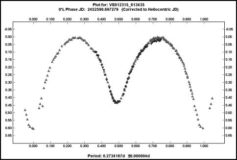
Figure 2. The phased plot of a variable star using two sessions. Compare to Figure 3.
The fits are very similar yet the periods differ by about 230 seconds. You must be careful when merging two sessions separated by a large number of cycles since a large number of closely related periods can give the same apparent fit of the data.
The change in the period solution was 0.001d, or 86.4 seconds. The time between
the two sessions was about 56 days, or 204.81558 revolutions. Or was it? Presume
for a moment that I didn’t get complete coverage on the first night, such that I
couldn’t get a better initial period. I might have come up with a period of 0.2707667d (6.4984h) and a difference of 0.00265d (229.0s). It also amounts to
208.62 cycles. A phased plot based on that alternate period is shown below.
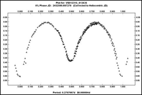
Figure 3. A phased plot for the wrong period.
This plot used the same data as used for Figure 2. The difference is that the assumed period for this curve is 229s less, or 6.498h instead of 6.546h.
It’s pretty hard to tell the difference and, if I didn’t know better from the
first night’s run, almost impossible to say which was the right one.
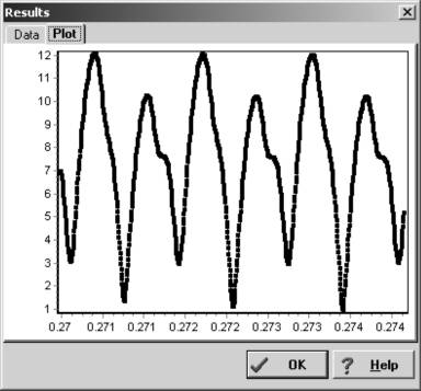
Figure 4. The Fourier analysis noise spectrum.
The RMS fit is plotted on the Y-axis and against the period in days, shown on X-axis. Minima point indicate a possible solution. The high number of solutions is the result of having a minimum number of sessions space by a large number of cycles.
I mentioned before the noise spectrum that’s available with Fourier analysis.
Figure 4 shows the noise spectrum plot in Canopus for the period search that lead to the accepted solution for this system, i.e., 0.2734167d. The X-axis is
the period – in days – that was sampled and the Y-axis is the RMS residual of
the data points against the ideal curve. Each one of the minimums in the noise spectrum plot represents a potential solution. As you can see, there are several
where the residual values differ by the smallest of amounts. What would have
made solving this period much easier was to get the second session data the next
night or as soon as possible after. That way, there would have been a minimum number of revolutions between sessions and the number of possible alias periods
would have been significantly less.
Had I been able to work the variable the night following my session two months after the initial session, I’d have met the requirement of getting two closely spaced sessions. Using the second and third sessions would have eliminated many of the aliases while the first, being some 200 revolutions removed, would have refined the period to a very high degree. Note that getting successive nights is not required to be at the start or even the end of all your sessions. You could get a session in November, two back-to-back in December, and one in January. The main point is getting two sessions as close as possible to one another. Figure 5 shows another noise spectrum from a different analysis.
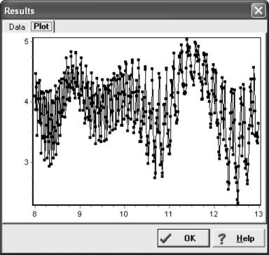
Figure 5. An intriguing noise spectrum.
Once again, the complex curve and high number of possible solutions is the result of data separated by a large number of cycles. The RMS fit is on the Y-axis and the period, in hours, is along the X-axis.
What in the world is going on here? First, you need a little background. I observed the asteroid 1263 Varsavia for a few days in April one year. I was not
able to return to it and so my friend Bob Stephens added quite a bit of extra data during the following May. I did a period search after Bob’s first run and
got the above noise spectrum. A large number of solutions presented themselves. Alan Harris gave us insight on the meaning of this particular spectrum.
“The broad ‘sinusoidal’ curve with minima at 8.3 hours, 10.8 hours, and 12.5 hours correspond to fits of the April data with half-cycle shifts between successive period minima. The high frequency ups and downs are minima corresponding to half-cycle shifts between your April data and Bob Stephens’ one session from last night. The structure is easy to understand, whether to believe any of the minima is the correct period solution would require seeing the resulting fits.”
As it turns out, ‘D’ – “None of the above” – was the right choice. After merging
all the data sets, the period turned out to be around 7.23 hours. The final noise spectrum in shown in Figure 6.
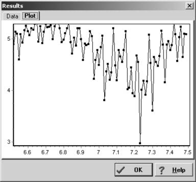
Figure 6. The final noise spectrum for 1263 Varsavia.
This is more reasonable since there is a decided winner for the lowest RMS value. However, that’s still no guarantee this period is the true one. The RMS fit is on the Y-axis and the period, in hours, is along the X-axis.
Sometimes you can eliminate a number of aliases by plotting the data against one-half the proposed period. If instead of a bimodal curve or pure chaos, you get something close to a monomodal curve, with only one maximum and minimum, then the proposed period has a very real chance of being correct. Let’s go back to that variable star with a very sensitive period and plot the half periods, i.e., 3.157h and 3.186h.
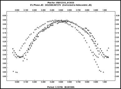
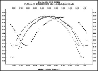
Now the “truth” is much easier to see. The plot on the left is the half period for the solution I adopted, i.e., 0.2744167d (6.564h), while the plot on the right is half the “what if” period I suggested, 0.2707667d (6.498h). Ignore the fact that the vertical alignment of the data in the plot on the left has much to be desired. Concentrate instead on the fact of how the maxima line up. They are very close. In the right-hand plot, there’s about as much agreement among the maxima as there is among a group of amateurs when asked which is the best commercially made SCT. If the curve is bimodal and you have a number of possible solutions, the half-period plot can be a big time saver.
Here are two plots of the raw data for 1022 Olympiada using data acquired on June 1999.
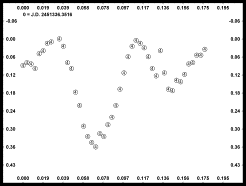
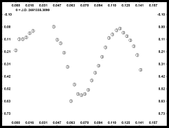
Using the Fourier Analysis in Canopus, the left-hand figure had a period of 3.8h while the period for the data shown in the right-hand figure had a period of 4.5h. Which is right?
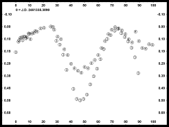
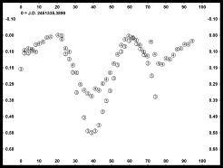
Here is a phase plot of the combined data. In this case, the left-hand figure period is 3.83h while the right-hand figure period is 4.6h. There is good agreement in the phase angle for the extrema and the overlap of data seems reasonable for both. Disregard for the moment, the mismatch of the data caused by a different amplitude in one of the curves. It was the result of a faint star.
One clue is that the magnitude values at 0% and 100% are a better matched for the 4.6h period. The most important clue comes in realizing the relationship between the two periods, i.e.,
4.60h * 5 rotations = 23.00h
3.83h * 6 rotations = 22.98h
and that, as you would expect from this whole discussion, the starting times of the two sessions were separated by 23 hours. Resolving aliases is one of the biggest challenges in determining lightcurve periods, especially for those that have multiples close to 24 hours.
Just when you thought you are getting the hang of things, I’ll give you a
parting reminder that you should never make assumptions about a curve and always
keep an open mind.
3155 Lee is a 10km asteroid that was discovered by Brian Skiff of Lowell Observatory in 1984. It’s named after the famous Confederate States of America
general, Robert E. Lee. Keeping with that theme, Skiff named two other asteroids
discovered about the same time “Lincoln” and “Grant”. The significant point of
interest about this asteroid is that it’s believed to be a splinter off the large main belt asteroid Vesta, created when Vesta and another asteroid collided
with one another.
I obtained initial images of the asteroid in November one year and, making the initial assumption of a bimodal curve, found a period of just over 4 hours. The fit was really very bad and it should have led me to be suspicious. You can see what I mean in the plot in Figure 7. How embarrassing!
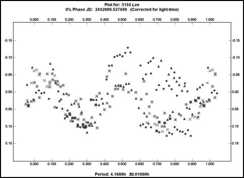
Figure 7. The lightcurve of 3155 Lee phased against 4.16 hours.
This is an example of forcing a square peg into a round hole. This period is, with a little experience, obviously not right.
After I posted the results on the Collaborative Asteroid Lightcurve Link Web site (CALL), I received a message from Dr. William Ryan of New Mexico Highlands University, Las Vegas, NM. He told me that 3155 Lee was part of a study he had been conducting and that his results indicated four maximums and minimums per rotation. I ran two more sessions on the asteroid in December and found that if I followed his suggestion that the curve had more than two maxima and minima, the data fit fairly well for a period of about 8.3 hours. Figure 8 shows that phased plot.
That new period is in close agreement with that obtained by Dr. Ryan. The lightcurve suggests a shape that agrees with the proposed origin for the asteroid, i.e., highly irregular, as one might expect if two asteroids collided and created one or more large pieces that went flying away on their own.
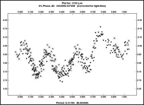
Figure 8. The final plot for 3155 Lee.
The period is about 8.3 hours. This is a rare example of a curve that shows four pairs of extrema during each rotation. The asteroid is believed to be a cast off following a collision between Vesta and another asteroid many eons ago.
You need to be open to solutions that are outside the norm. Sometimes, as I did in this case, you might try to fit a square peg in a round hole by forcing a
solution to fit expectations instead of letting the data dictate the solution. In my college days, we called this “curving a fit” and it is easy to let happen
if you are not careful.